
Discover how to create a peaceful, serene home with our ultimate guide to choosing calm paint colors.
Imagine coming home after a long day to a space that feels like a tranquil oasis. A place where the walls are painted in calming hues that instantly help you unwind and relax. If this sounds like the home of your dreams, then you're in the right place.
In this ultimate guide, we'll explore expert tips on choosing the perfect calm home paint colors to create a soothing atmosphere in your living space. From understanding color undertones to utilizing natural light, we'll cover everything you need to know to transform your home into a peaceful sanctuary. Let's dive in and discover how you can bring serenity and tranquility into your space with just a few brushstrokes.,
Understanding Color Undertones
When choosing the perfect calming paint color for your home, it's essential to consider the undertones present in different shades. Color undertones can greatly impact the overall feel of a room, so it's important to understand how they can influence the atmosphere you're trying to create.

Pro tips for finding the perfect undertone
- 1. Use Paint Samples in Different Lighting
The same paint color can look different depending on the lighting in your home. Test samples in both natural and artificial light to observe shifts in undertone. For example, natural light may bring out warm undertones, while artificial lighting may highlight cooler undertones.
- 2. Compare Colors to True Neutrals
Place the paint sample next to a true white or gray color. This will help you better see any hidden undertones. For instance, a "neutral" beige might reveal pink or yellow undertones when contrasted with white.
- 3. Check the Color Formula or Label
Paint labels or brand swatches may indicate the undertones. Many companies use descriptive names (e.g., "Cool Gray" or "Warm Beige") to hint at the color’s base tones.
By paying attention to undertones such as warm, cool, or neutral, you can ensure that your chosen paint color enhances the sense of calmness in your living space.
Now, let's explore how you can further enhance the soothing ambiance of your home by utilizing natural light to complement your chosen paint colors.,
Utilizing Natural Light
Natural light plays a crucial role in how paint colors appear in a space. When choosing calming colors for your home, it's important to consider how natural light interacts with them.
Rooms with ample natural light can enhance the soothing effect of lighter paint colors, while darker shades may absorb more light, creating a cozy and intimate atmosphere.

Did you know paint colors have a LRV value? Using this value can help you pick the perfect paint color.
The Reflective Value (RV) or Light Reflectance Value (LRV) of a paint color is a measurement of how much light the color reflects. It's a useful tool for choosing paint, especially when considering the lighting and size of a room. Here's how to use it:
- 1. Understand the Scale
LRV is measured on a scale from 0 to 100, where 0 is absolute black (absorbing all light) and 100 is pure white (reflecting all light). Most paint colors fall between 5 and 95 on the scale.
- 2. Brighten or Darken a Room
Higher LRV values (above 60) indicate lighter colors that reflect more light, making them great for brightening up dim or small spaces. Use these in rooms that need more natural light, like basements or north-facing rooms.
Lower LRV values (below 50) mean darker colors that absorb more light, making a room feel cozier or more intimate. These are ideal for large, bright rooms where you want to add warmth or mood.
- 3. Control the Ambiance
Mid-range LRVs (40-60) create a balanced ambiance and are versatile for various spaces. They’re great for living rooms or bedrooms, where you want a mix of warmth and openness.
- 4. Match with Lighting
In rooms with natural light, a higher LRV color can help maximize brightness. In spaces with artificial light, lower LRV colors may help control glare and add depth.
- 5. Complement Design Elements
The LRV can help coordinate your paint choice with other design elements. For instance, if your flooring or countertops have darker tones, a higher LRV on the walls can balance the contrast. Conversely, if your decor is light, a lower LRV on the walls can add richness without overwhelming the space.

By considering LRV, you can better control how paint colors affect the brightness and feel of a room. Many paint brands list the LRV on their color swatches, or you can ask a paint expert for this information
This thoughtful approach to incorporating natural light into your home design can help you achieve a seamless blend between your calming paint colors and the overall ambiance of your space.,
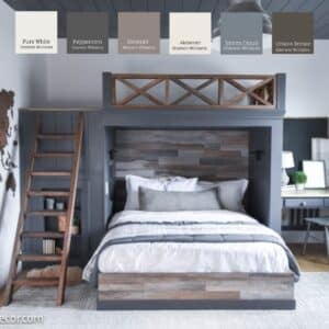
Creating a Cozy Atmosphere
To enhance the cozy atmosphere in your home, consider adding soft textures like plush pillows, fuzzy blankets, and area rugs in complementary colors to your calming paint scheme.
These cozy elements can create a sense of warmth and comfort, further enhancing the tranquil environment you're aiming for. Integrating these cozy accents will not only add visual interest but also provide a tactile experience that invites relaxation and rejuvenation.

By thoughtfully blending these textures with your chosen paint colors, you can create a harmonious and inviting space that promotes a sense of calm and serenity.
Now, let's explore how incorporating accent colors can add depth and dimension to your calming home paint colors.,
Incorporating Accent Colors
Incorporating accent colors thoughtfully can enhance a calm and serene atmosphere at home. Here are some tips for selecting and applying accent colors to create that peaceful ambiance:

- 1. Choose Soft, Muted Accent Colors
Opt for accent shades that complement the overall color palette while maintaining a soothing vibe. Colors like soft blues, sage greens, lavender, and muted grays are known for their calming effects.
- 2. Balance with Neutral Tones
To maintain a calm atmosphere, pair accent colors with neutral base tones like white, beige, taupe, or light gray. These neutrals create a clean backdrop that allows your accent colors to subtly stand out without creating visual clutter.
- 3. Limit the Number of Accent Colors
Stick to one or two accent colors to avoid overstimulating the space. This will help create a sense of harmony and flow throughout the room, which is essential for maintaining a calm atmosphere. For example, pairing soft blues with creamy whites can evoke a coastal serenity, while warm greys and blush tones can add a cozy, spa-like feel.
- 4. Natural Hues for Grounding
Colors found in nature, like sand, stone, or soft green, are inherently calming. Incorporating these shades as accent colors—through plants, wood elements, or natural textiles—can enhance a grounded, peaceful environment.
- 5. Use Accent Walls Sparingly
If you want to introduce an accent wall, choose a soft, calming color like pale blue or soft blush. Accent walls can add dimension to a room but should not be too bold or harsh in tone if your goal is tranquility.
- 6. Complement Natural Light
If your room receives ample natural light, use it to highlight your accent colors. Lighter shades will appear brighter and airier, while muted tones will maintain their softness without becoming overpowering.
By carefully selecting soft, complementary accent colors and pairing them with neutral tones, you can create a peaceful home environment that feels both balanced and inviting
Final Tips for Success
To ensure success in your paint color choices, it's important to consider how the colors will interact with natural light in the room. Take note of how the colors shift throughout the day and how they make you feel in different lighting conditions. This will help you create a space that feels calm and inviting regardless of the time of day.

Another key factor to keep in mind is to test your chosen paint colors on a small area of the wall before committing to painting the entire room. Paint colors can look different once applied to a large surface, so it's essential to see how they appear in your specific space. This simple step can save you time, money, and potential disappointment in the long run.

Lastly, don't be afraid to trust your instincts and go with the colors that truly resonate with you. Your home is a reflection of your personality and style, so choose colors that speak to you on a deep level. By following these final tips, you can create a calming sanctuary that not only looks beautiful but also feels like a true retreat from the chaos of everyday life.,
Happy Painting!
Brooke


Leave a Reply