This guide includes coordinating shades, design tips, and room-by-room inspiration for a serene, stylish space.
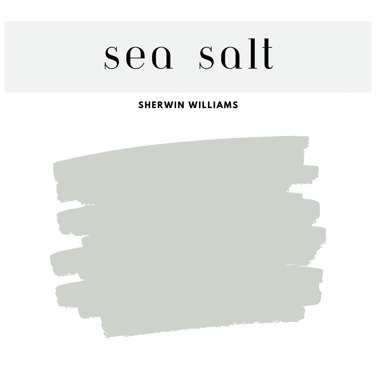
If you’ve ever searched for the perfect soft green-blue-gray hue, chances are you’ve discovered Sherwin-Williams Sea Salt (SW 6204). Loved by homeowners, interior designers, and DIYers alike, Sea Salt is the ultimate calming color that brings a relaxed, breezy feel to any space.
This serene shade belongs to a larger family of harmonious hues that create a tranquil, beachy palette—ideal for modern coastal, cottage, farmhouse, and transitional styles. In this post, we’ll explore 20+ Sherwin-Williams colors that pair beautifully with Sea Salt, including coordinating paint colors, trim options, deeper accents, and more.
Why Sherwin-Williams Sea Salt Is So Popular
Sea Salt is a chameleon color that shifts subtly depending on lighting. In natural light, it leans more greenish-blue, while in darker rooms, the gray undertone becomes more pronounced. It’s soft enough to be used as a neutral but with enough color to give character.
Undertones: green-gray with blue influences
LRV (Light Reflectance Value): 63
Best Rooms: Bathrooms, bedrooms, kitchens, laundry rooms, living spaces
Style Match: Coastal, farmhouse, Scandinavian, transitional
How to Use the Sea Salt Palette in Your Home
Living Rooms
Pair Sea Salt with white or beige furniture, add natural textures like jute and linen, and introduce deeper greens like Retreat for balance.
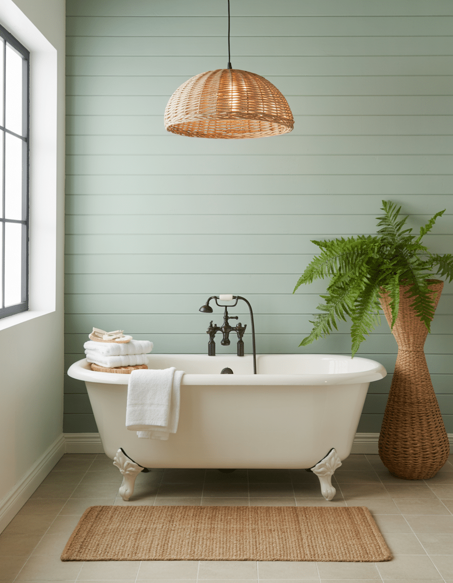
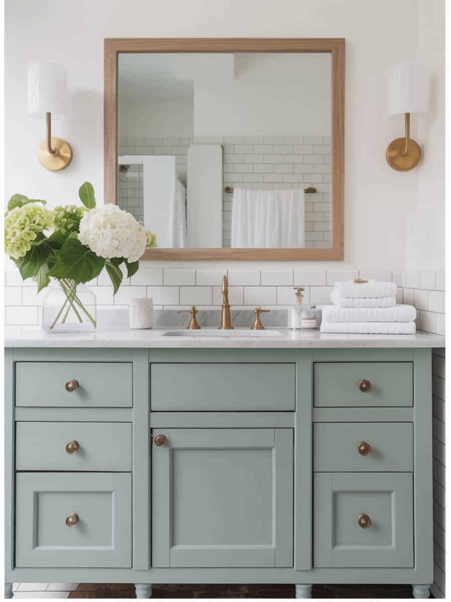
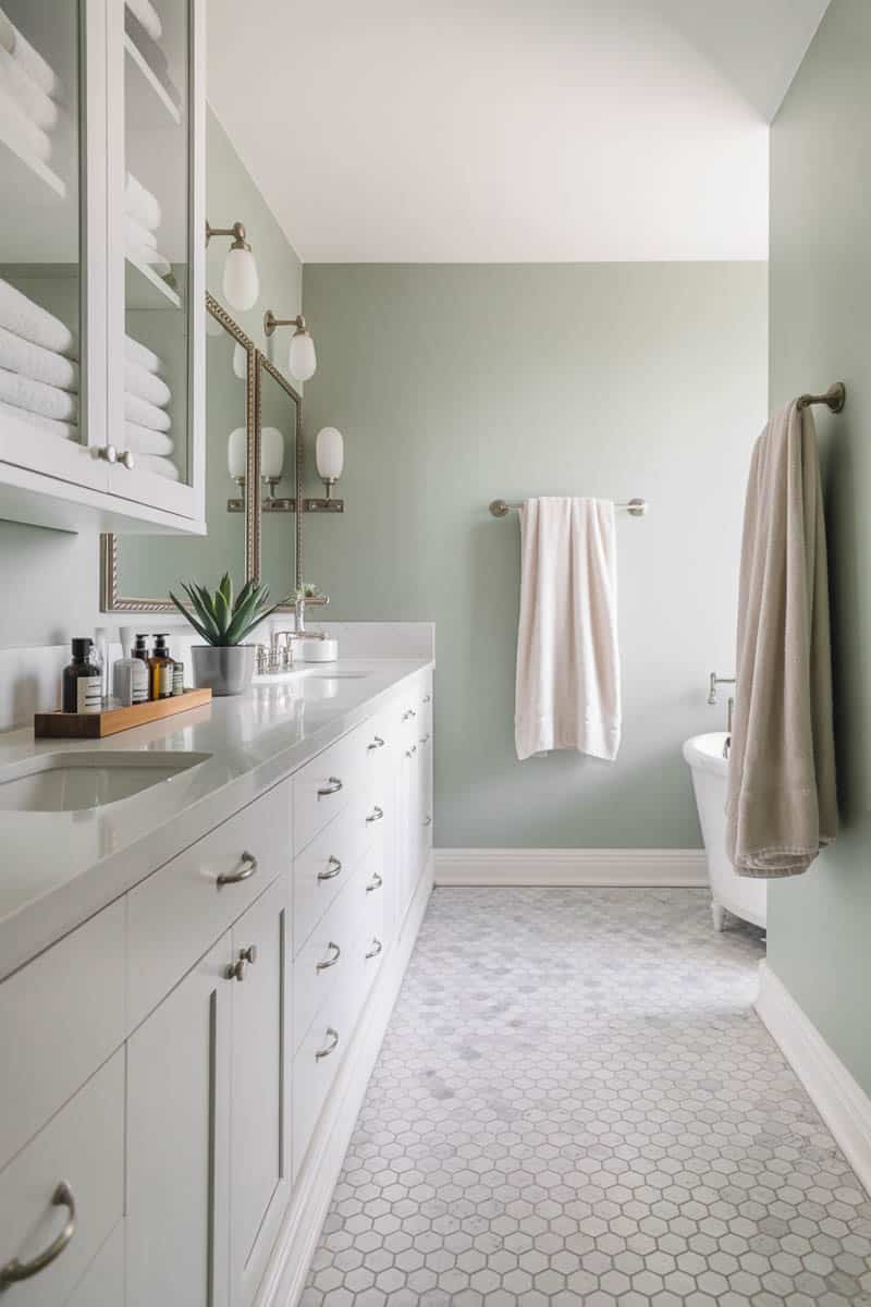
Bathrooms
Use Sea Salt on walls, Alabaster or Spare White for trim, and Rainwashed for a pop in towels or cabinetry.
Bedrooms
Create a soft retreat with Comfort Gray or Silver Strand as accents, and layer with white bedding and wood tones.
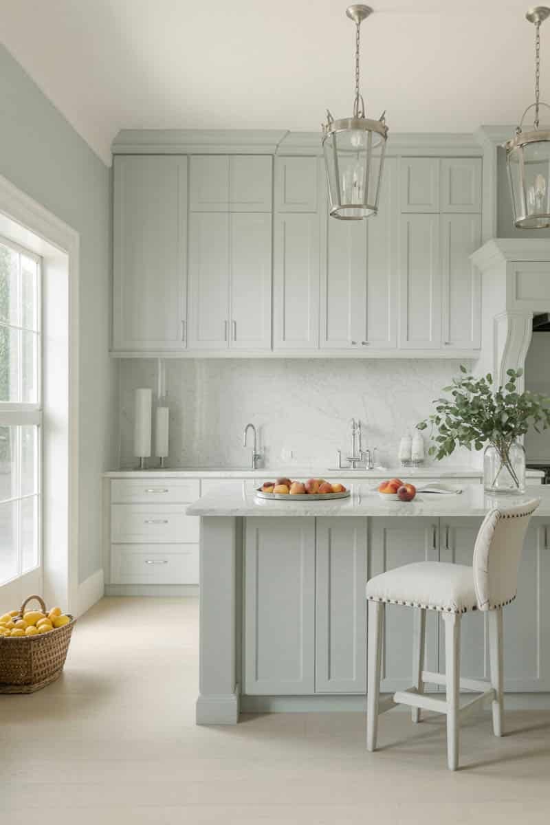
Kitchens
Use Sea Salt on cabinetry or walls with Shoji White or Greek Villa for a light, welcoming feel. Try Pewter Green or Evergreen Fog for islands or lower cabinets.
20+ Sherwin-Williams Colors That Pair Beautifully with Sea Salt
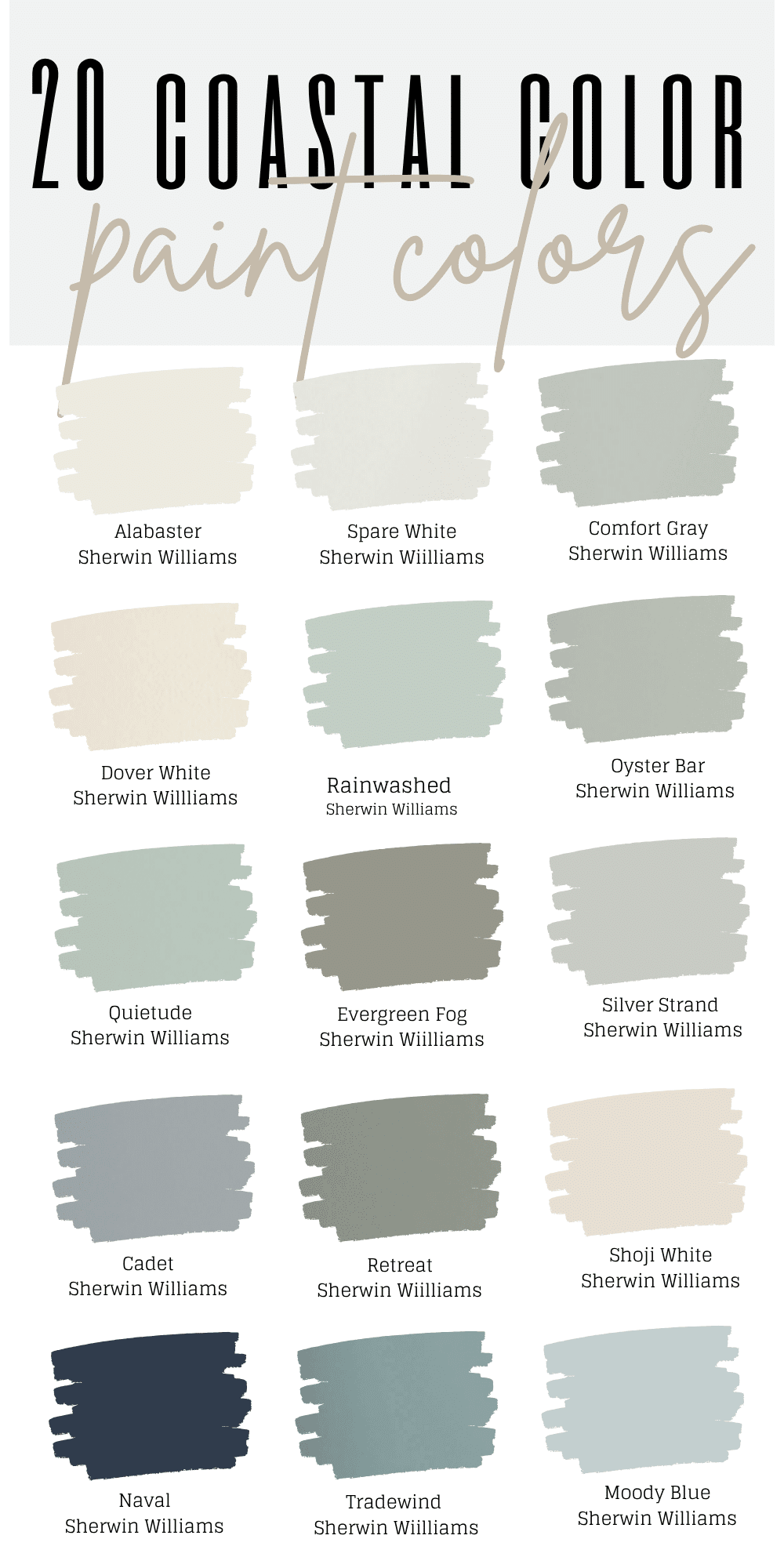
Whether you're planning an entire home color scheme or just accenting a single room, here are some top Sherwin-Williams colors that work beautifully with Sea Salt:
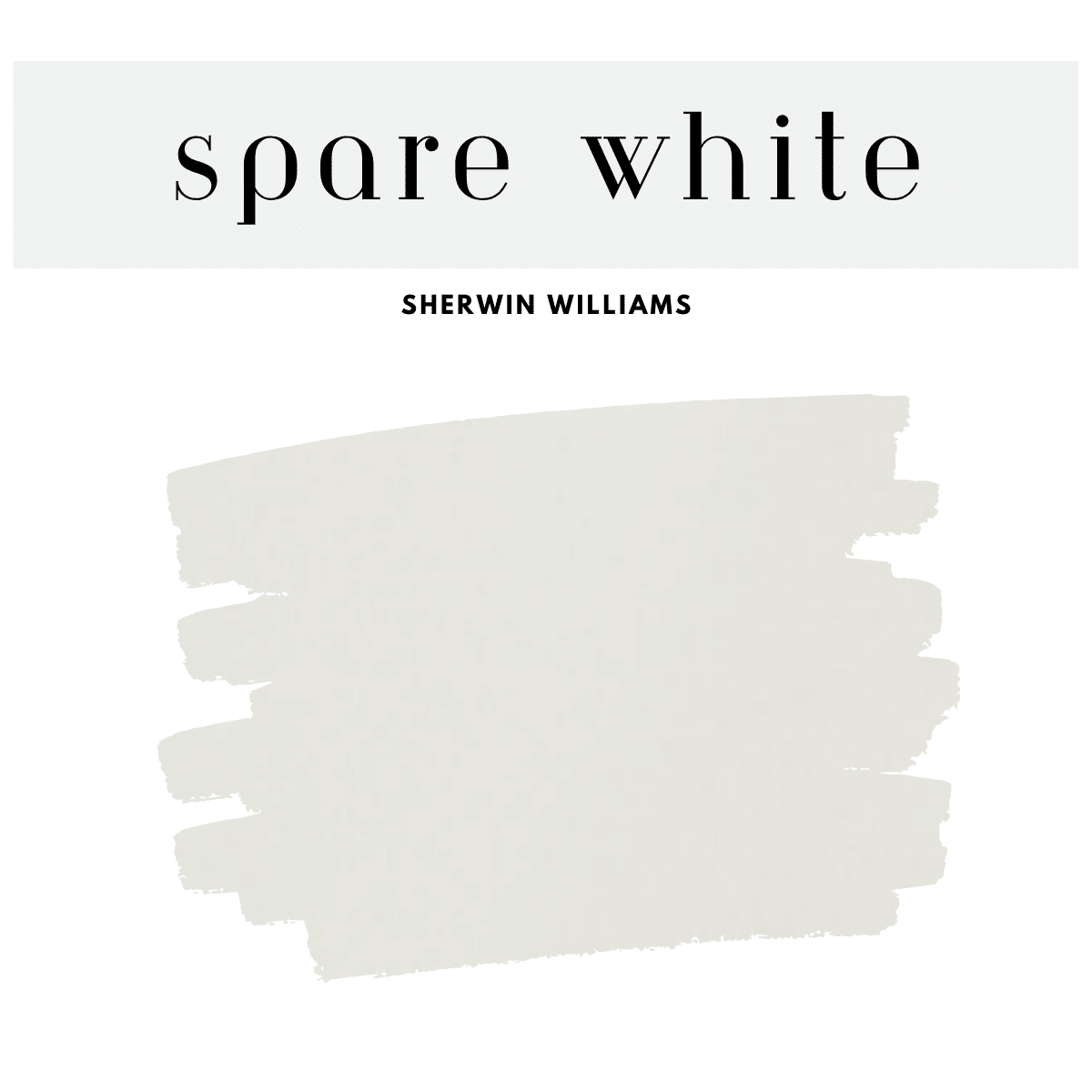
1. Spare White (SW 6203)
A crisp, cool white that subtly matches Sea Salt’s undertone. Great for trim and ceilings.
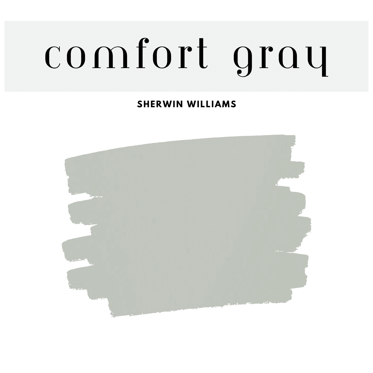
2. Comfort Gray (SW 6205)
One step darker than Sea Salt in the same color strip. It’s a sophisticated mid-tone that layers perfectly.
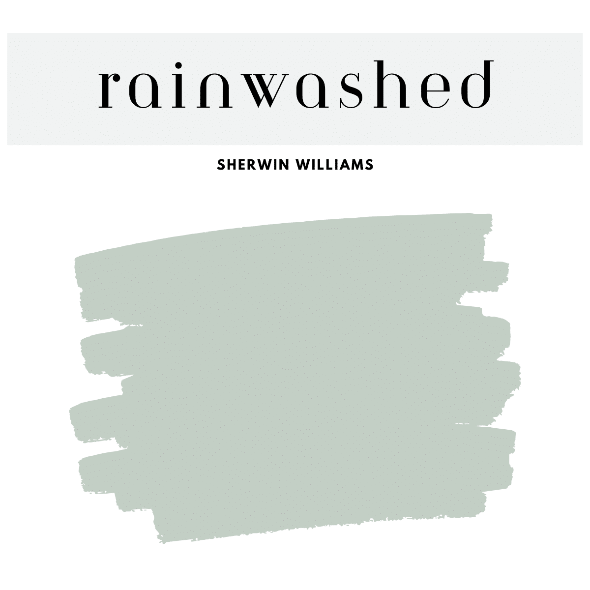
3. Rainwashed (SW 6211)
A more pronounced blue-green with a little more saturation. Ideal for bathrooms or laundry rooms.
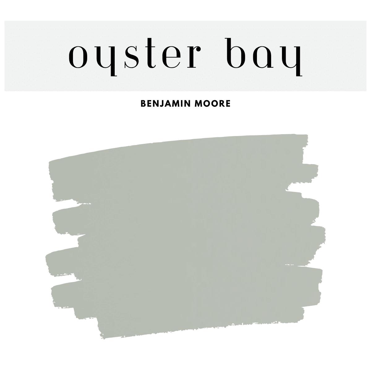
4. Oyster Bay (SW 6206)
A bold accent that maintains the Sea Salt vibe but adds a deeper, earthier green tone.
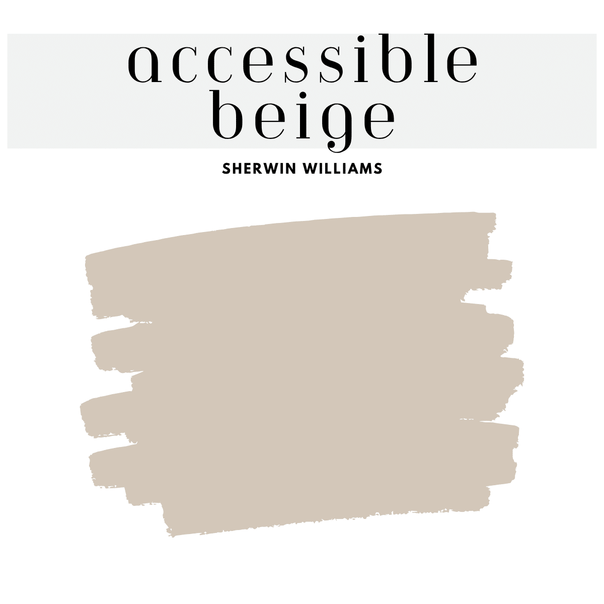
5. Accessible Beige (SW 7036)
Warm and balanced, this beige brings a neutral grounding to the coolness of Sea Salt.
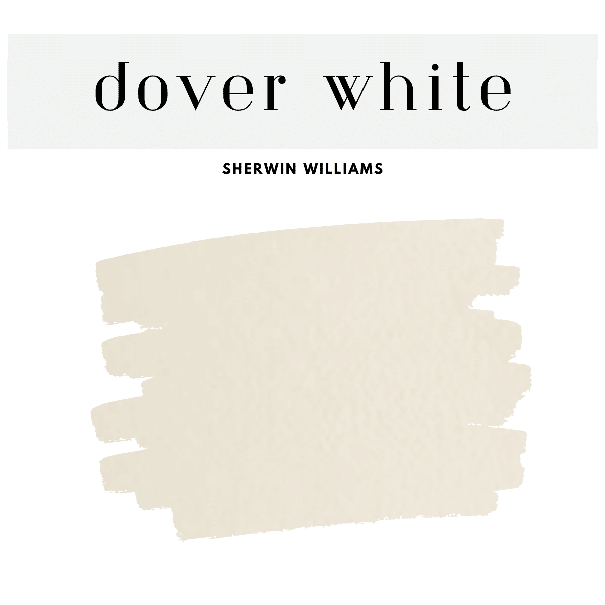
6. Dover White (SW 6385)
A soft, creamy white that keeps things warm and cozy while complementing Sea Salt’s cool tones.
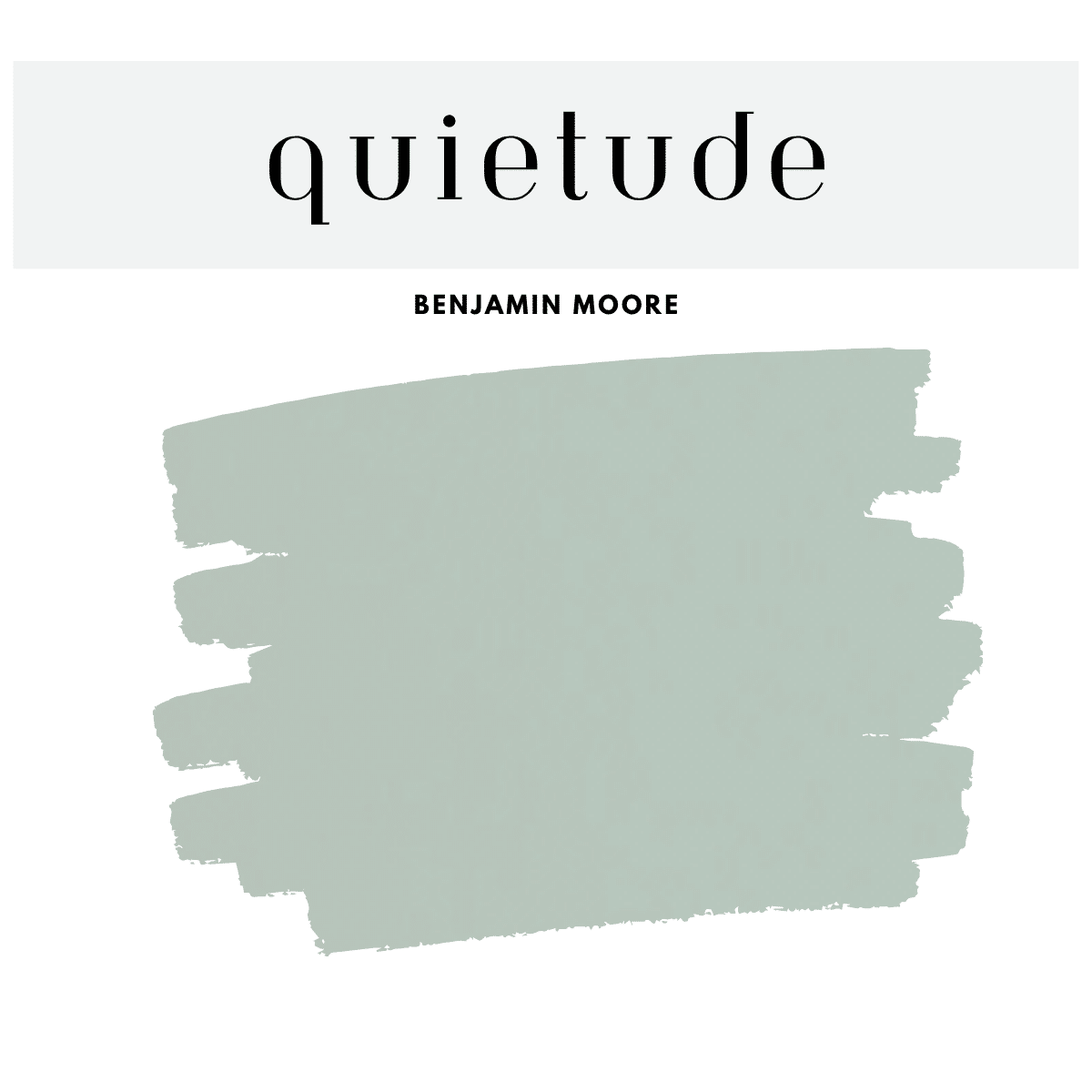
7. Quietude (SW 6212)
Quietudeis a soft, tranquil blue-green that adds a peaceful touch to home hallways. Its gentle hue brightens narrow spaces while creating a cohesive flow between rooms. Pair it with crisp white trim and natural light to make your hallways feel airy, fresh, and welcoming.
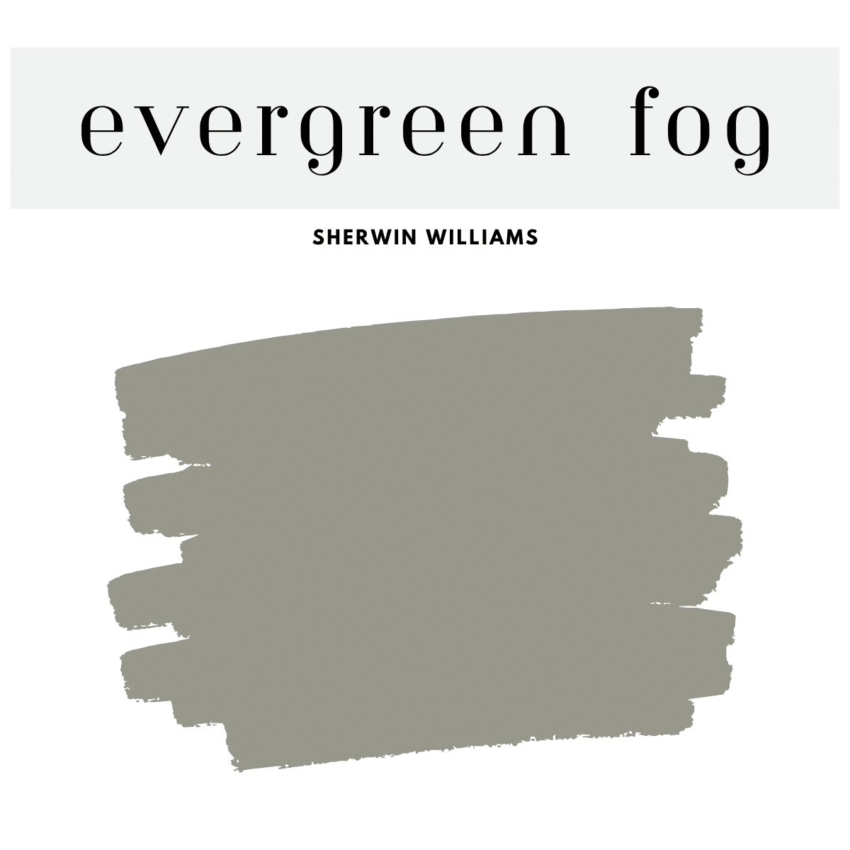
8. Evergreen Fog (SW 9130)
Evergreen Fog was the color of the year in 2022. A serene blend of green and gray with subtle hints of blue, making it a perfect choice for creating a calming atmosphere.
Use it in bedrooms, bathrooms, or living spaces to add a touch of nature-inspired sophistication. It also pairs beautifully with warm neutrals, wood tones, and brass accents for a balanced, modern look
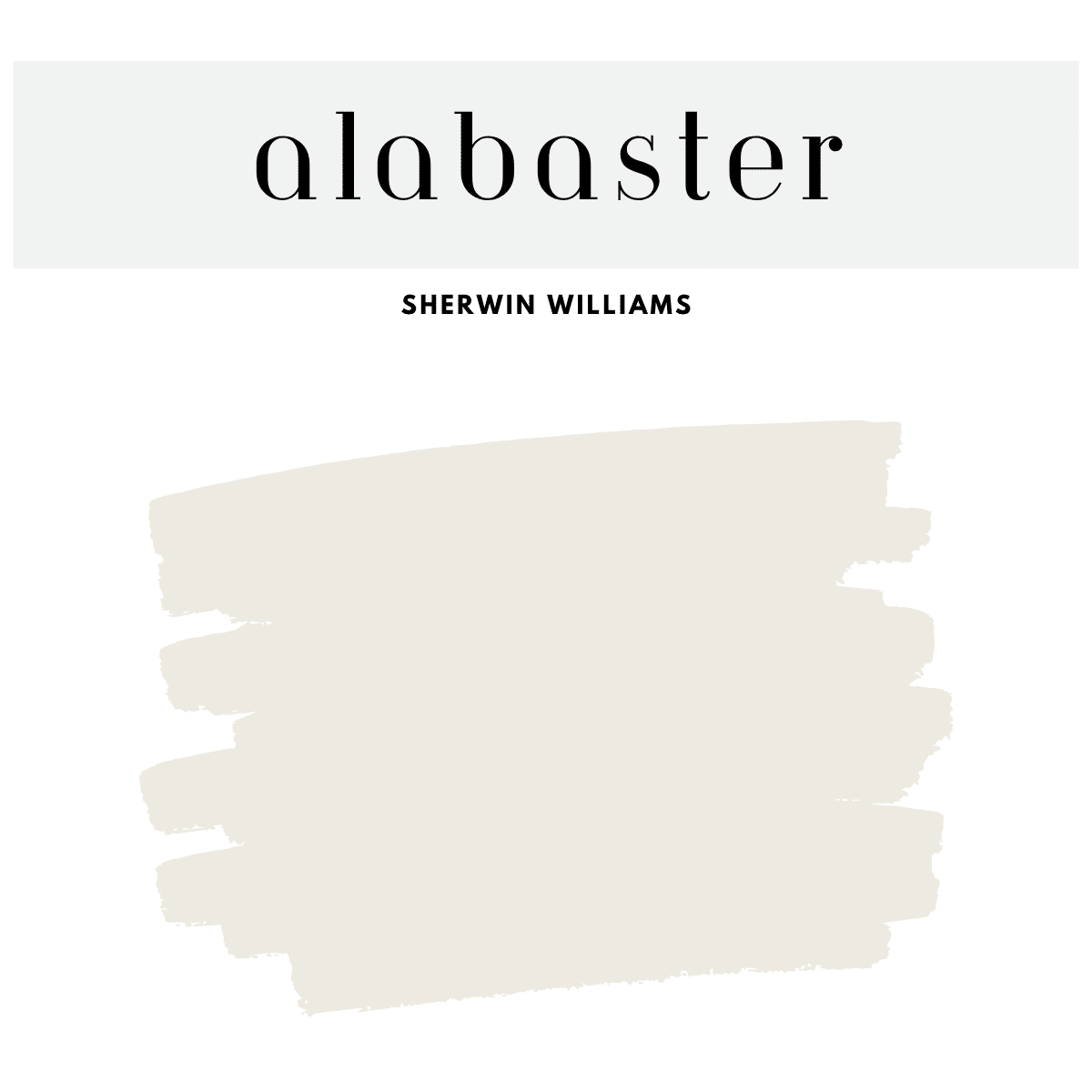
9. Alabaster (SW 7008)
Alabaster by Sherwin-Williams is a soft, warm white that works beautifully in almost any room of the home. It’s perfect for walls if you want a clean, neutral backdrop that still feels cozy and inviting.
Use it on trim, cabinetry, or ceilings to create a seamless, bright look when paired with deeper accent colors. Whether you're going for modern farmhouse, traditional, or minimalist style, Alabaster brings timeless elegance to your space
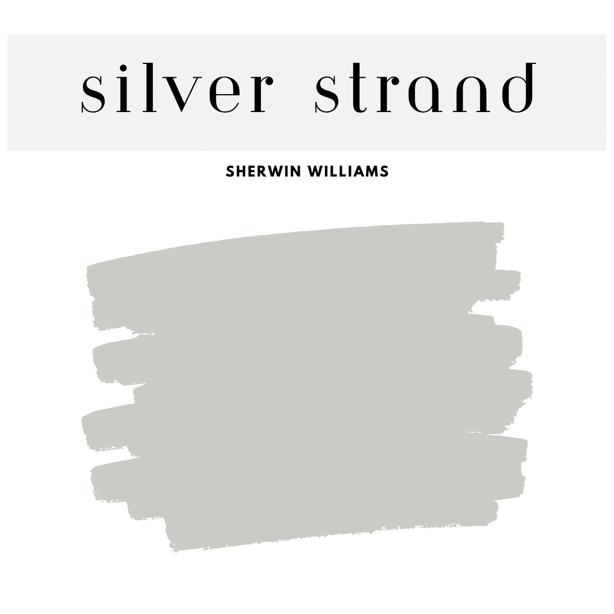
10. Silver Strand (SW 7057)
Silver Strand by Sherwin-Williams is a cool, elegant gray with hints of blue and green, making it a versatile choice for any room in your home.
It works beautifully in bedrooms, living rooms, or bathrooms to create a calm, spa-like atmosphere. Pair it with a sea salt palette and white trim, soft textures, and natural elements for a fresh, timeless look.
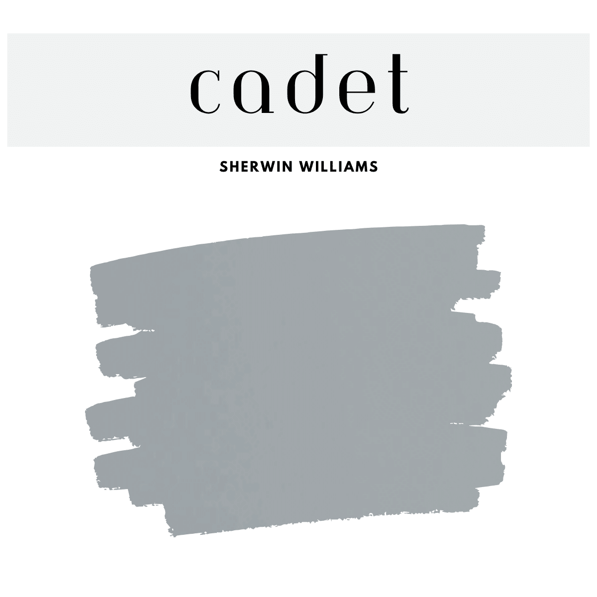
11. Cadet (SW 9143)
Cadet by Sherwin-Williams is a deep, muted blue that brings a sense of focus and sophistication to a home office. Its moody tone creates a grounded environment that's perfect for productivity while still feeling stylish.
Pair it with light wood furniture, brass accents, and soft white trim to balance the richness of the color.
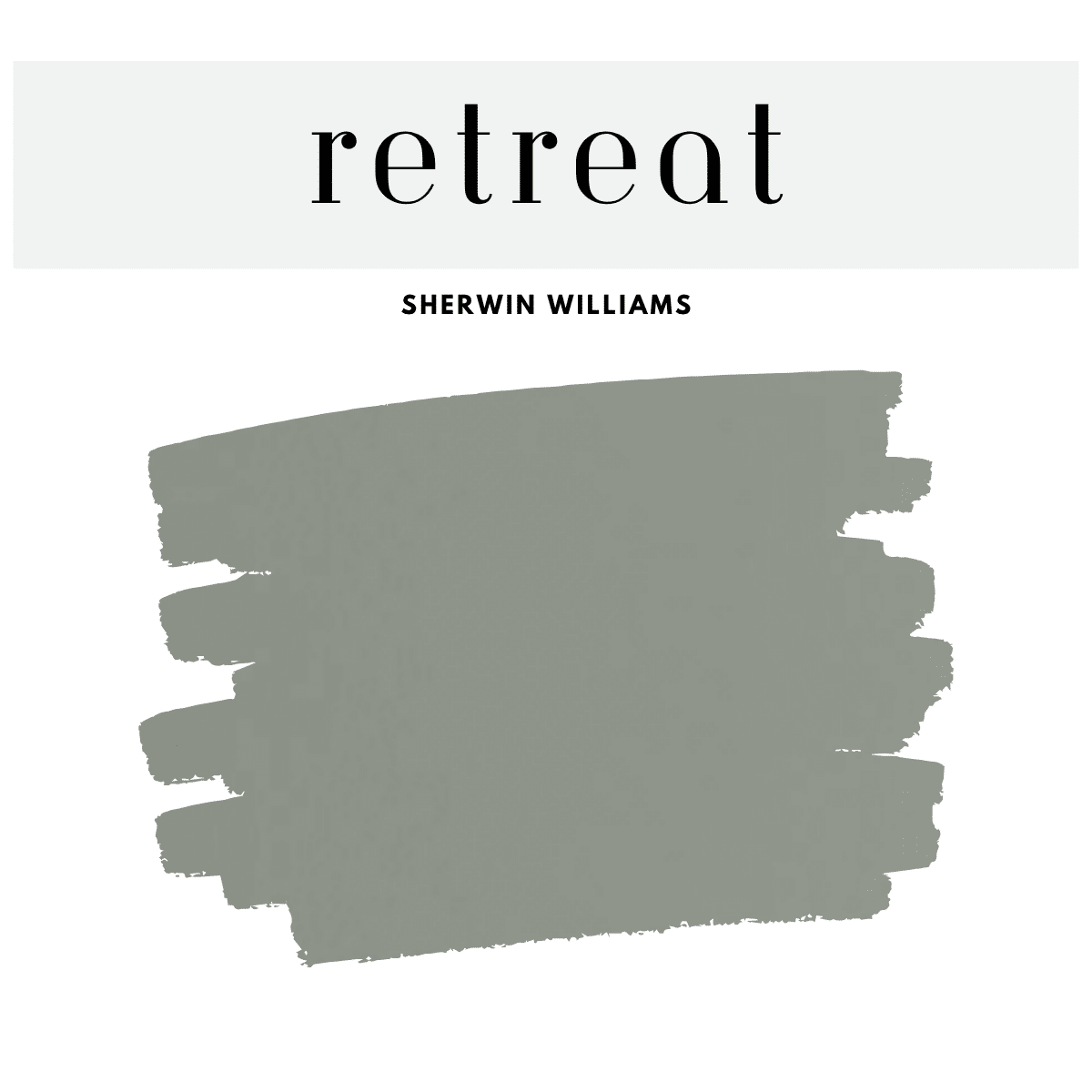
12. Retreat (SW 6207)
Earthy and sage-like, this deeper green can work for accent furniture or a front door.
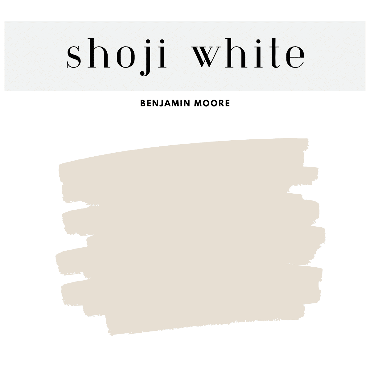
13. Shoji White (SW 7042)
A creamy white that brings warmth to Sea Salt without clashing with its coolness.
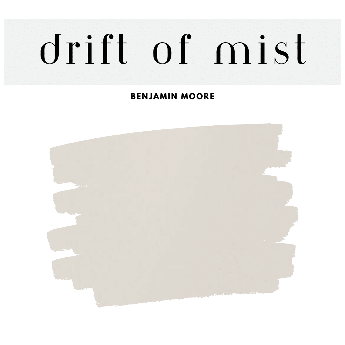
14. Drift of Mist (SW 9166)
A neutral, barely-there gray that pairs beautifully with Sea Salt in minimalist settings.
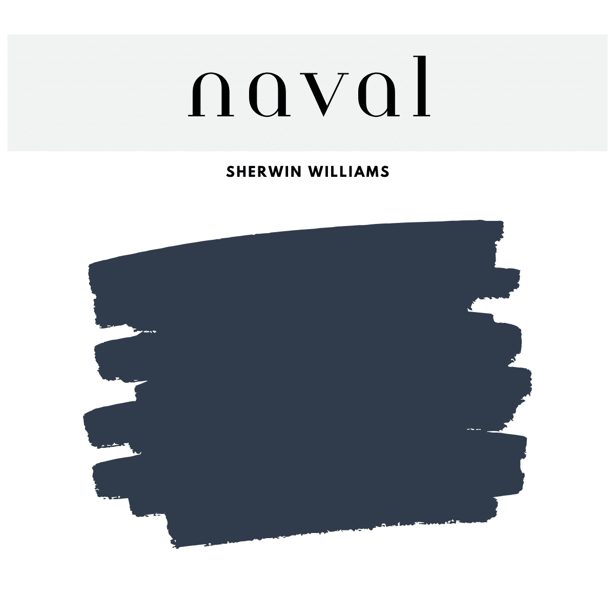
15. Naval (SW 6244)
Naval is a rich, classic navy that brings depth and drama to a kitchen space. Use it on lower cabinets or an island to create a bold focal point, balanced by light countertops and brass or gold hardware for a sophisticated finish.
16. Tradewind (SW 6218)
A peaceful light blue, it enhances and continues the calming coastal vibe that Sea Salt creates. This hue adds a refreshing, airy feel to any space.

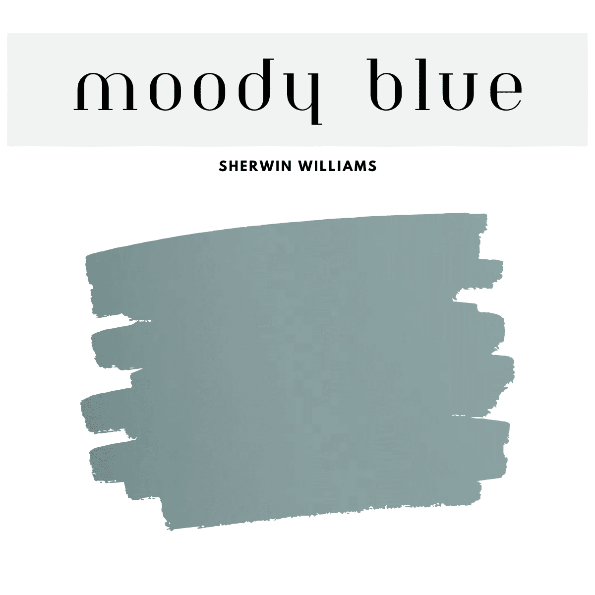
17. Moody Blue (SW 6221)
For a pop of energy, this blue-green shade is beautiful with Sea Salt in coastal bedrooms.
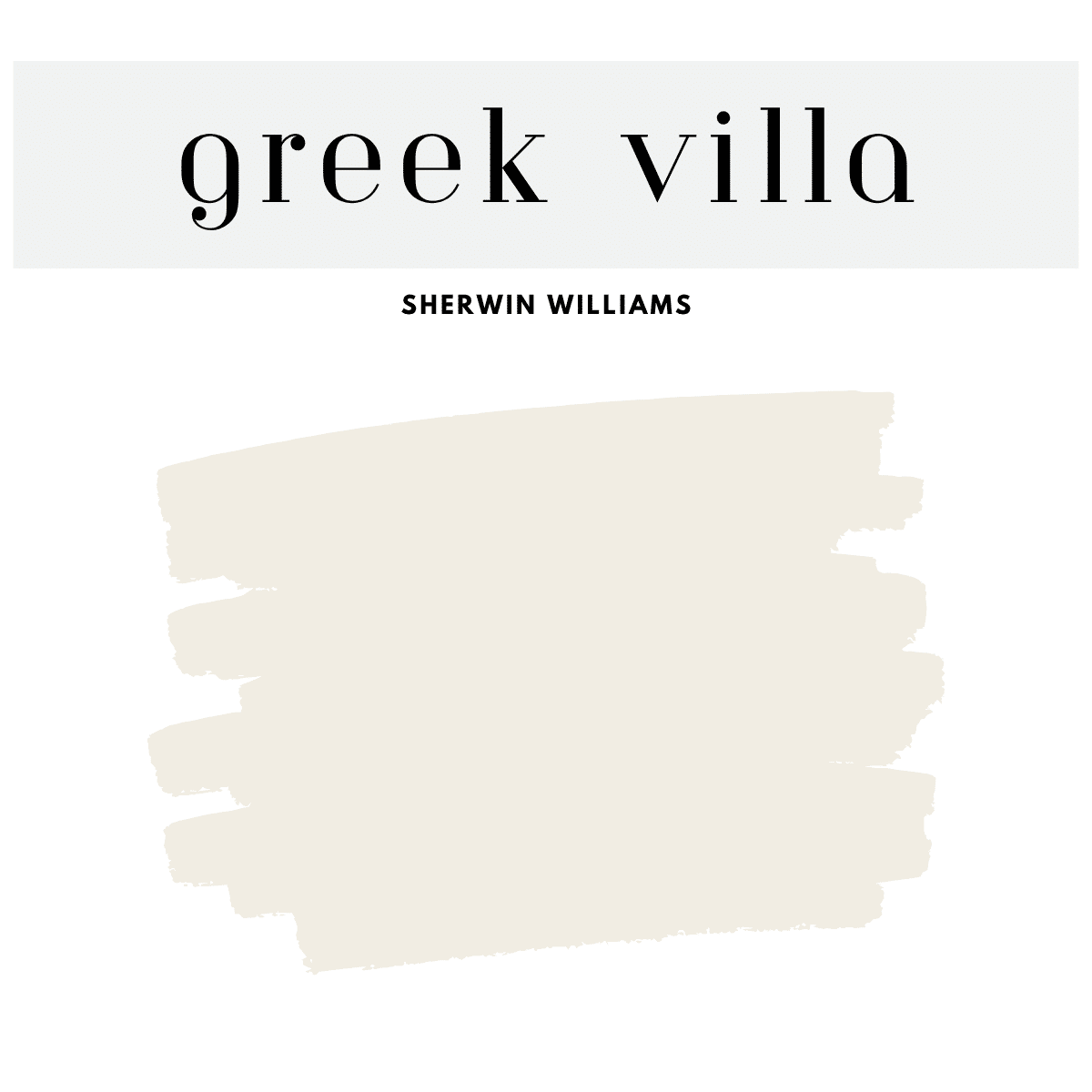
18. Greek Villa (SW 7551)
Greek Villa is a warm, creamy white that provides the perfect soft backdrop for the cool, calming tones of the Sea Salt palette. Use it on walls, trim, or cabinetry to brighten spaces while allowing colors like Sea Salt, Comfort Gray, and Rainwashed to shine as complementary accents
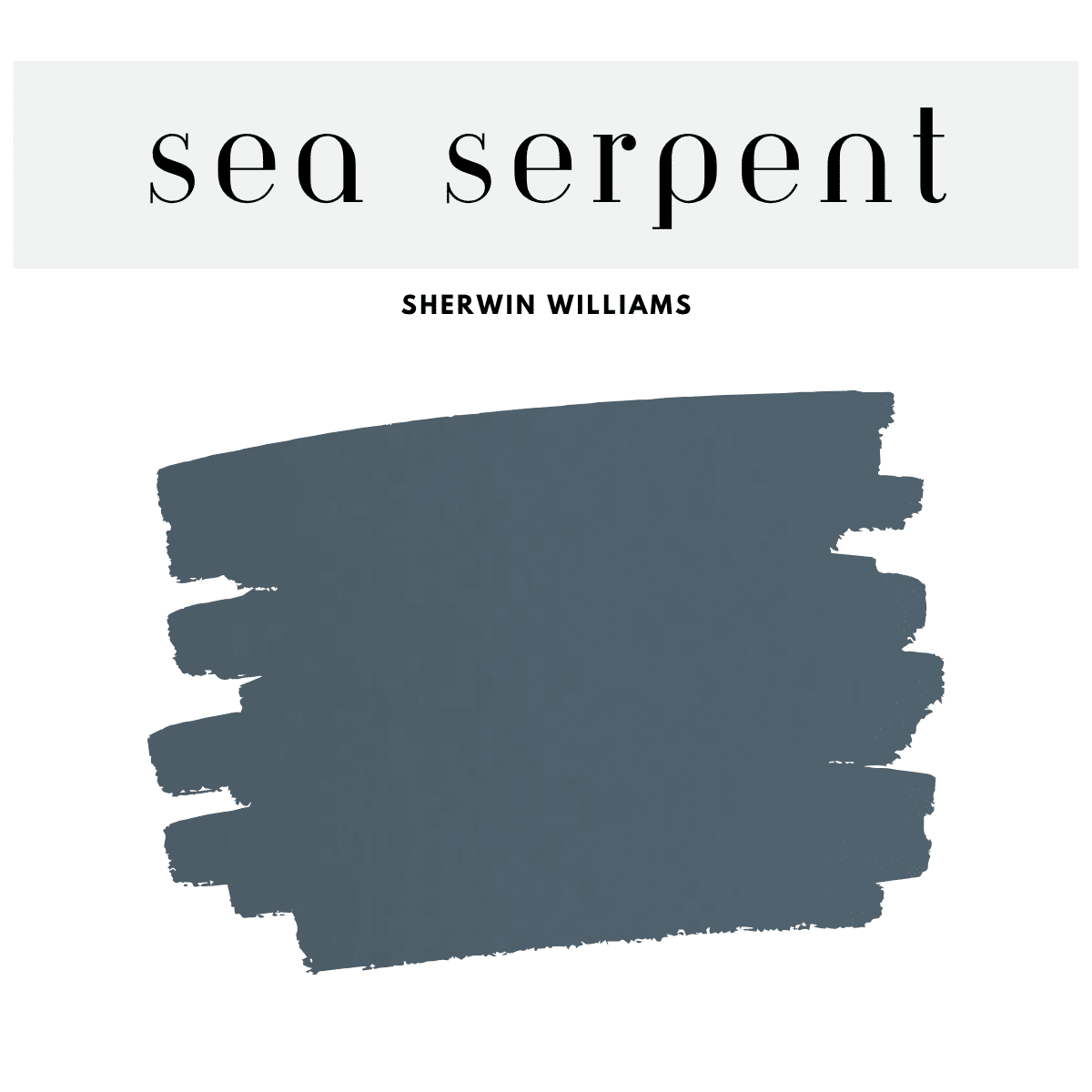
19. Sea Serpent (SW 7615)
A rich, dark blue-green that works wonderfully with Sea Salt for drama and contrast.
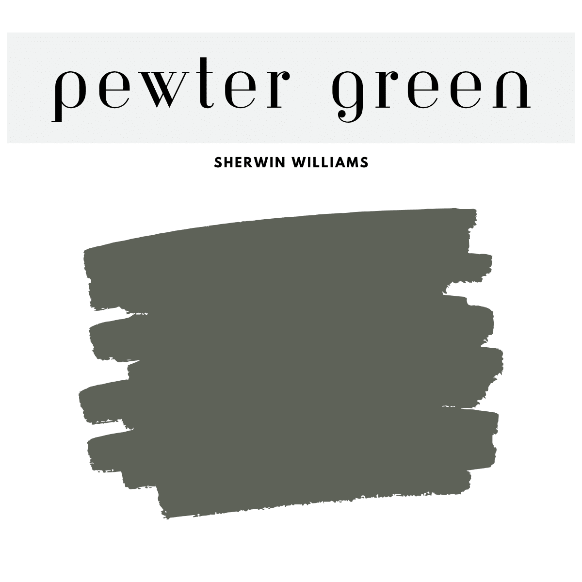
20. Pewter Green (SW 6208)
Deep and grounded, this works for accent cabinetry or an earthy color pop in any Sea Salt-based room.
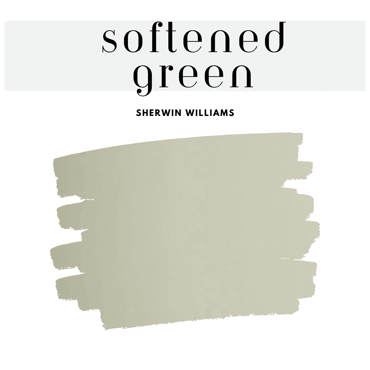
21. Softened Green (SW 6177)
A subtle sage green with warmth and grace, keeping things earthy but airy.
Finishing Touches with Sea Salt
The Sherwin-Williams Sea Salt Palette is perfect for anyone looking to create a peaceful, stylish, and timeless home. With its balance of green, blue, and gray, Sea Salt plays well with neutrals, deep tones, and other coastal colors, making it a versatile base for nearly any room.
Whether you go all-in with a whole-home Sea Salt scheme or just want to refresh a bathroom or guest bedroom, the colors above will help you build a cohesive and calming space.
Ready to Transform Your Home?
Save your favorite shades, grab some sample pots, and test them in your space. Lighting can shift tones dramatically, so always try a swatch before committing.
Happy painting!
Brooke


Leave a Reply