
Finding the perfect color pairings for Sherwin Williams Accessible Beige can transform your space into a warm, inviting, and effortlessly stylish retreat.
Sherwin-Williams Accessible Beige (SW 7036) is a timeless neutral that has become a favorite among homeowners and designers alike. It’s the perfect balance between warm and cool, making it incredibly versatile. Unlike traditional beiges that lean heavily into yellow undertones, Accessible Beige has a subtle greige (gray + beige) base that keeps it modern and fresh.

If you’re considering Accessible Beige for your home, you may be wondering which colors pair best with it. The good news? It coordinates beautifully with a range of hues, from soft neutrals to deeper accent shades. In this post, we’ll explore a carefully curated palette of Sherwin-Williams colors that complement Accessible Beige effortlessly.
The Perfect Color Pairings for Sherwin Williams Accessible Beige
This versatile neutral, with its soft greige undertones, strikes the perfect balance between warmth and sophistication, making it a go-to choice for both modern and classic interiors. Let’s explore the best colors to complement this timeless favorite!

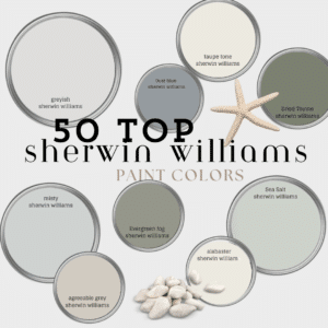
1. Cadet (SW 9143) – A Soft Blue with a Sophisticated Edge
If you want to add a touch of subtle color to your space while keeping it serene, Cadet is a fantastic choice. This muted blue has just enough gray in it to keep it from feeling too vibrant, making it an excellent pairing with Accessible Beige. Use Cadet in bedrooms, bathrooms, or even kitchen cabinets for a refined yet calming look.
2. Pure White (SW 7005) – Crisp and Clean
For trim, ceilings, and even cabinetry, Pure White is a go-to option when using Accessible Beige. It’s a warm white without heavy yellow undertones, which keeps it from looking too stark. Pure White will give your space a fresh and cohesive appearance while allowing Accessible Beige to shine.
3. Sea Salt (SW 6204) – A Relaxing Green-Blue Neutral
If you love a spa-like atmosphere, Sea Salt is a must-have companion to Accessible Beige. This soft greenish-blue has a chameleon-like quality that shifts beautifully depending on the lighting. It’s perfect for bathrooms, bedrooms, and even accent walls to add a subtle coastal feel without being overwhelming.
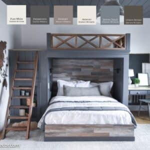
4. Urbane Bronze (SW 7048) – A Bold, Moody Accent
For those looking to add contrast and depth, Urbane Bronze is an excellent accent color. As a deep brown with gray undertones, it provides a stunning contrast against Accessible Beige. Consider using it for doors, built-ins, or even a feature wall to create a dramatic, yet sophisticated look. I painted my bathroom with Urbane Bronze for a moody feeling. See all the details here
5. Evergreen Fog (SW 9130) – A Modern Green with a Touch of Gray
Evergreen Fog was Sherwin-Williams’ 2022 Color of the Year, and for good reason—it’s a soft, nature-inspired green that works beautifully with warm neutrals. Pairing Accessible Beige with Evergreen Fog creates a peaceful and organic color scheme, perfect for living rooms, home offices, or entryways.
6. Dovetail (SW 7018) – A Rich, Mid-Toned Gray
If you’re looking for a darker neutral to ground your space, Dovetail is an excellent choice. This warm gray works as a striking contrast to Accessible Beige while maintaining a cohesive feel. It’s particularly stunning on kitchen islands, vanities, or even exterior accents like shutters or doors.
7. Alabaster (SW 7008) – A Soft, Warm White
For a softer white option than Pure White, Alabaster is a great alternative. This creamy, warm white is ideal for walls, ceilings, or trim, creating a gentle contrast with Accessible Beige. It works beautifully in spaces where you want a cozy, inviting atmosphere without stark contrasts.
Painting Kitchen Cabinets in Accessible Beige for a Subtle Pop
One of the best ways to incorporate Accessible Beige into your home is by using it on kitchen cabinets. While many people opt for traditional white or deep-colored cabinetry, Accessible Beige offers a refreshing alternative that adds warmth and sophistication.

Why Choose Accessible Beige for Cabinets?
- Soft Contrast: If you have white or off-white walls (such as Alabaster or Pure White), Accessible Beige provides a soft, subtle contrast that keeps your kitchen feeling airy and open.
- Versatility: This warm greige pairs beautifully with both light and dark countertops, from marble to butcher block and even sleek quartz.
- Timeless Appeal: Unlike stark white cabinets that can sometimes feel too sterile, Accessible Beige adds a touch of warmth without overwhelming the space.
- Pairs Well with Hardware: Whether you choose brushed nickel, matte black, or even antique brass, Accessible Beige allows hardware finishes to shine.

Coordinating Colors for a Balanced Kitchen Design
- Walls & Trim: Pair with Alabaster (SW 7008) or Pure White (SW 7005) for a crisp and elegant look.
- Island Accent: For contrast, paint your kitchen island in a bolder shade like Urbane Bronze (SW 7048) or Evergreen Fog (SW 9130).
- Backsplash & Decor: Consider using Sea Salt (SW 6204) or Cadet (SW 9143) in decor elements like dishware, textiles, or a subtle backsplash to introduce depth and character.
- Hardware Selection: Opt for gold or matte black hardware for a sophisticated touch, or go with brushed nickel for a softer, more traditional feel.
By using Accessible Beige on kitchen cabinets, you can create a kitchen that feels both stylish and inviting. Whether paired with crisp whites or rich accents, this versatile neutral ensures your cabinetry remains a standout feature in your home.
How to Use This Color Palette in Your Home
Now that you have the perfect coordinating colors, here are some ways to incorporate them into your home:

- Whole-House Neutral: Use Accessible Beige as your main wall color throughout your home for a timeless and versatile base.
- Trim & Doors: Pair with Pure White or Alabaster for a clean and seamless look.
- Accent Walls: Try Dovetail or Evergreen Fog for an elegant touch of contrast.
- Cabinetry: Use Cadet or Sea Salt for a hint of color in kitchens and bathrooms.
- Bold Features: Introduce Urbane Bronze on built-ins, interior doors, or exterior details for depth and character.

By thoughtfully selecting coordinating colors, you can create a cohesive, sophisticated home with Sherwin-Williams Accessible Beige as the star. Whether you prefer a soft and airy aesthetic or a more dramatic contrast, this palette offers endless possibilities.
Whether you're looking to create a cozy, monochromatic palette or add a pop of contrast with bold accents, Accessible Beige pairs beautifully with a variety of shades. From crisp whites and deep charcoals to soothing blues and earthy greens, the right color combinations can enhance its subtle elegance and create a harmonious look throughout your home.
Happy Decorating
Brooke
Looking for more color inspiration? Check out these other color palettes.

Leave a Reply